Tuesday, March 30, 2021

The Great Depression and Art

     The early 20th century was a whirlwind of events for both the world and the United of States. The First World War rocked the world from 1914 to 1918 and the Second World War took hold of the world from 1939 to 1945. In addition to these two great calamities, the U.S., and subsequently the world, was hit by the Great Depression which ate up the years between 1929 to 1939. This was a especially difficult time for the American people because it was caused by events that were out of the control of the normal individual. 

    The Stock Market Crash of 1929 was caused by the trading of over 12 million shares in a single day. This resulted in the loss of billions of dollars and took out thousands of investors. To top this, The Dust Bowl was the name given to the droughted Southern Plains of the U.S. which suffered severe dry periods and dust storms during the 1930s. In a country where the "American Dream" was determined by how hard an individual worked, it was devastating when these out-of-control events ripped that dream of success from millions of individuals. This was a time where dreams where shattered and futures looked bleak, all of which is visible in the artwork of the time. 


Man beside Wheelbarrow, Dorothea Lange
San Francisco
c. 1934

    The first piece we will discuss is Man beside Wheelbarrow by Dorothea Lange. This gelatin silver print captures a sunken down man, head in his hands, leaning against a wall, and his wheelbarrow overturned. The black and white color help convey the seriousness of the situation, this man is suffering through the Great Depression. Another element to note is the positioning, or space, of the objects, the man is hunched over next to the wheelbarrow. This helps the viewer find the connection between the wheelbarrow and the man, the man was likely a blue-collar worker who now sits without employment, signified by the wheelbarrow sitting overturned next to him. Finally comes the contrast between the man and his surroundings. It helps to bring the viewers attention to the man himself and makes the viewer linger on the hunched over and broken man. 
    This piece gives me a sense of distress and brings me sadness. Growing up surrounded by blue collar workers instilled in me a sense of duty and hard work. I can only imagine how these individual felt during this time of uncertainty and despair, after having lived hard working lives dedicated to their respective crafts, I can't imagine how lost these individuals felt during this time without work. 


Apple Vendor, Barbara Stevenson
United States
c. 1934

    The second piece is Apple Vendor by Barbara Stevenson. The colors chosen for  this piece are help portray the seriousness of the situation that was being faced by the American people. There is nothing fancy about the colors chosen, they are mute and simple, and there seems to be little blending of colors throughout the piece. The focal point of the piece is the man sitting and selling apples. An interesting element to note here is the lines of the drawings, while the man hunched over man is the focal point of the  painting, lines from his head and feet seem to focus in on the mother and child that stand behind him hand-in-hand. It seems to me like this piece not only portrays the harsh reality of the time, but it also chooses to focus on the near future that can come from the child, the soft yellow background helps with this image. While the piece has touches of sadness, it still also shows a ray of hope. 

PH -77, Clyfford Still
United States
c. 1936

    The third and final piece is PH-77 by Clyfford Still. At first glance, this may seem like a normal painting that shows two men collecting wheat from a field. It is only when you take a closer look at the piece and its artistic elements that you begin to see the ties to the great depression. First is the choice of color. Like Apple Vendor, there is nothing fancy about the color choice, they are not vibrant or exotic, they are mute and basic. Next, we must look at the shape of the men. They look anatomically correct with the exception of their arms. Their arms are unnaturally long, this could be a reference to the drought that was being experienced by Southern Plains of the U.S. and can symbolize the difficulty that farmers were having with crops. The workers had to reach so much more in order to live. Finally, we must take not of the tone of the piece. The area surrounding the two men is dark but the men themselves are wearing bright shirts. This choice of tone in this piece could be used as a way to current despair of the situation but the brightness around the men could serve to demonstrate the hope that things will take a turn for the better. 


Works Cited

"Clyfford Still and Dorothea Lange: Iconic Images of the Depression." Clyfford Still Museum. 12 June 2020. Web. 31 Mar. 2021. <https://clyffordstillmuseum.org/blog/clyfford-still-and-dorothea-lange-iconic-images-of-the-depression/>.

History.com Editors. "Dust Bowl." History.com. A&E Television Networks, 27 Oct. 2009. Web. 31 Mar. 2021. <https://www.history.com/topics/great-depression/dust-bowl>.

History.com Editors. "Stock Market Crash of 1929." History.com. A&E Television Networks, 10 May 2010. Web. 31 Mar. 2021. <https://www.history.com/topics/great-depression/1929-stock-market-crash>.

Lange, Dorothea. "Dorothea Lange. MAN beside WHEELBARROW, San Francisco. 1934: MoMA." Web. 31 Mar. 2021. <https://www.moma.org/collection/works/295202>.

"PH-77, 1936." Clyfford Still Museum Online Collection. Web. 31 Mar. 2021. <https://collection.clyffordstillmuseum.org/object/ph-77>.

Stevenson, Barbara. "Apple Vendor." Smithsonian American Art Museum. Web. 31 Mar. 2021. <https://americanart.si.edu/artwork/apple-vendor-23048>..


Monday, March 22, 2021

Impressionist and Post-Impressionism


Impression, Sunrise by Claude Monet
Paris
c. 1872

    For this blog post, I have decided to compare Impressionist and Post-Impressionism art. The first impressionist piece I have chosen is Claude Monet's Impression, Sunrise. The impressionist movement was characterized by small, thin and visible brush strokes, open composition, a strong emphasis on accurately depicting light and its changing qualities, ordinary subject matter, the inclusion of movement, and unusual angles. With this piece in particular, the three elements that I will be taking a closer look at include lines, texture, and tone. Because impressionist artists of this era focused more on ordinary subject matter, the tone of colors used in this piece aren't as vibrant of colors as you would see in previous eras the colors used to depict this foggy landscape mimic the cooler tones one would experience out in the shipyard. Another important factor in impressionist art is the incorporation of movement in the pieces, this is done by the use of lines and brushstrokes in this piece. In addition to heavier brushstrokes indicating waves, the lines connecting the three smaller rafts and the angle at which the piece is drawn from all helps to create the sensation of movement in the piece, giving it an even more realistic feel.  


The Fighting Temeraire by J.M.W. Turner
London
c. 1839

    My second impressionist piece is The Fighting Temeraire. Much like Impression, Sunrise, this piece stays true to the impressionist movement by its use of light brush strokes and realistic subject matter. The lines and angle of this piece serve to capture that classic sensation of movement that is present in many impressionist paintings. Having the drawing all converge onto one spot on the canvas and the angle at which the shadows are elongated at, gives the sensation of not only a moving galley but of a setting sun. The colors used in this painting don't exaggerate the setting, it stays true to nature and helps to make the viewer feel like this is directly from their own point of view. 


The Large Plane Trees by Vincent van Gogh
Netherlands
c. 1889

    The first Post-Impressionism piece I chose was The Large Plane Trees by Vincent van Gogh. While the various post-impressionism artist were not all in agreement concerning a cohesive movement, post-impressionist work extended impressionism while rejecting its limitations. They still used real-life subject matter, opted to create art outdoors instead of a studio, used vivid colors and often thick application of paint, but they were also much more inclined to distort form, emphasize geometric forms, and didn't shy from the use of unnatural color. The linework of the trees is incredibly pronounced in this piece. It serves as a perfect way demonstrate the thick application of paint and the post-impressionism emphasis on distorted forms. The use of vivid colors is in stark contrast to the impressionist use of more muted and realistic colors of the impressionist era. 


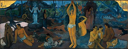
Where Do We Come From? What Are We? Where Are We Going? by Paul Gauguin
Tihiti
c. 1898

    Gauguin art perfectly exemplifies some of the stark differences between the two eras of art. Here we see Gauguin depicting a relatively normal scene of people gathering. The post-impressionist can be seen in the somewhat bizarre (when compared to impressionist art) lines that make up the human outlines, the defined oil on canvas (leaving behind the light brush strokes), and the unnatural geometric shape of the trees and shrubbery in the background. This piece gives the viewer a sense of mysticism and self reflection.  

    Impressionists where more focused with capturing nature and scenes in a more realistic way. They were focused on making sure the piece felt realistic and natural. They accomplished this through their linework, choice in tone and colors, manipulation of light and shadows, and by making many of the pieces feel like they were moving. Post-impressionism strove to recapture some of the mysticism of art, they created works that, while still influenced by natural scenes, still had an wisp of abstract and a seemed lightly unusual. Of the two, I prefer post-impressionism. I feel like it captures the natural beauty of life while still adding that hint of creativity that I believe makes art so incredible. I like impressionism and am astounded by the skill of the artists of the time, but they feel somehow less when compared to post-impressionist art. 


Works Cited

Anonymous. (2020, November 04). The large plane TREES (road menders at Saint-Rémy). Retrieved March 23, 2021, from https://www.clevelandart.org/art/1947.209

Guild, U., Shovava, Day, T., Comma, & Colorsheets, V. (2020, September 08). How this one Painting sparked the Impressionist movement. Retrieved March 23, 2021, from https://mymodernmet.com/claude-monet-impression-sunrise/

Turner, J. (1970, January 01). The fighting temeraire. Retrieved March 23, 2021, from https://www.nationalgallery.org.uk/paintings/joseph-mallord-william-turner-the-fighting-temeraire

Where do we come from? What are we? Where are we going? (2021, March 09). Retrieved March 23, 2021, from https://en.wikipedia.org/wiki/Where_Do_We_Come_From%3F_What_Are_We%3F_Where_Are_We_Going%3F


Monday, March 15, 2021

Classical Art in the 1700's: Era of Revolution

    The 1700's was a time for revolution and creation. The once suppressed middle class was now able to buy, sell, and trade art. Alongside this new freedom, the American colonists were frustrated with the British monarchy and consequently engaged them in a war for their freedom. From this stemmed the American Revolution and alongside it, an unlikely connection between Revolution and Art. 


King George III by Allan Ramsay
Studio of Allan Ramsay, British Empire
c. 1761

    The first work of art that I chose is this portrait of King George III, the ruling monarch during the American Revolution (1765 - 1783). I decided to start my gallery with this portrait in order to set the tone with how the different social classes saw themselves. This portrait depicts King George in his cushy coronation robes, with a stoic expression, leaning against something in a nonchalant manner and with a background that suggests a comfortable and safe setting. The art elements serve to further push that narrative. There is a soft texture to the portrait, accompanied by mute colors and curvy lines.
    This piece is important in demonstrating the difference in socioeconomic classes and helps one understand how the colonists viewed British monarchy. The colonists saw a king living a plushy lifestyle while they were being unnecessarily taxed to help the King pay for a war that they had nothing to do with. 

George Washington before the Battle of Trenton by John Trumbull
Philadelphia
c. 1792

    The second work of art is this portrait of George Washington by John Trumbull. I chose this portrait because it is a perfect example of how the American colonists viewed their leader and serves as a perfect contrast to the portrait of King George. Washington is portrayed standing tall and confident amid an ongoing battlefield. The color choice, like the King George portrait, is mute but while that art element in the portrait of King George makes the subject's surroundings appear safe and comfortable, it makes the portrait of Washington look serious and almost ominous. The people knew that this is a leader who was out in the battlefield fighting alongside them, not across the ocean in a lavish castle. 
    This piece shows the perfect contrast to how the colonists viewed their two leaders, and with the increased popularity of buying, selling, and trading art, it's easy to see how these two images were cemented into the colonist mind. 

Oath of Horatii by Jacques-Louis David
Paris
c. 1784

    I end this gallery with the Oath of Horatii, which encapsulates the Roman legend. The legend goes that in order to settle a dispute from the two warring cities of Rome and Alba Longa, three men from each city is chosen in order to fight on the behalf of their city. The victor of the fight will be the victorious city. Even across the ocean, art was being used at this time in order to fan the flames of revolution. This piece of art urges patriotism and loyalty to the nation. Although this piece was painted four years before the French Revolution, it served to fill the common people with a love for their country. This then went on help spark revolution when the common people felt that the French monarchy was no longer helping their beloved nation. 
    This painting is chocked full of strong lines that help portray unity amongst the people. Lines from the strong stance of the three sons and father intersect and bring the viewer's attention to the three swords in the father's grip. The women are made up of curves that invoke a sense of sadness, these three men are going to war for the entirety of their city. This sadness however is quickly dispelled by the overpowering hard lines of the men and the strong lines of the pillars in the background of the piece. 

    These three pieces serve to show just how art was used to fan revolution across the western world during the 1700's. The first two pieces served to depict how the American colonists viewed their British Monarchy and their in-home leaders. The third piece demonstrates how art was used to unify the people through a sense of pride and patriotism. Of the three, I would most want to own the Oath of Horatii for its portrayal of duty. 


Works Cited

King George IIIwww.npg.org.uk/collections/search/portrait/mw02455/King-George-III.

Metmuseum.org, www.metmuseum.org/art/collection/search/12823.

“Neo-Classicism and the French Revolution.” Oxford Art Online, www.oxfordartonline.com/page/Neo-classicism-and-the-French-Revolution.

“Oath of the Horatii.” Wikipedia, Wikimedia Foundation, 10 Mar. 2021, en.wikipedia.org/wiki/Oath_of_the_Horatii.


Manga Hit the Mainstream

To continue with the trend of eastern artwork, this blog will be focused on the centuries old art style of manga. Much like anime, manga has...